
The Lancers arrived in the Big South with a new purpose. Now they have a new look.
A new logo unveiled Wednesday, April 9 reflects the progress Longwood University athletics have made since 2007: transitioning to Division I and entering the Big South Conference, in which the Lancers posted their first-ever championship in their first year of competition. Modified from the mark used since 2006, the new logo is powerful and modern—a bold statement that the Lancers have arrived.
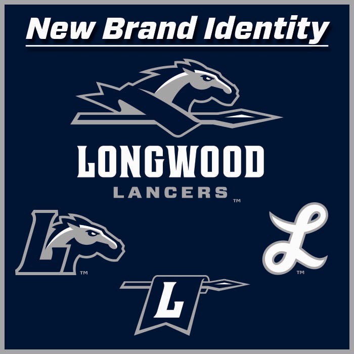
A darker blue color, and new horsehead and banner, give the primary logo a stronger and more athletic feel to be featured on uniforms, courts, fields and apparel. A consistent outline allows the new logo the flexibility of compatibility with any background color—permitting Longwood to use a consistent mark regardless of the setting, which strengthens the Longwood Lancers brand.
Joining the primary Longwood Lancers mark are three official secondary marks: The Cursive L, Banner L, and Block L and Horsehead.
- The Cursive L is a familiar mark to the Longwood family. The "L" has been used by Longwood baseball for decades and will now become an official mark of all Longwood athletics.
- The Banner L is a new logo that complements the existing family, joining key features from existing marks in a fresh, exciting way. The mark features a banner inscribed with a large block L hanging from a lance. It will be used primarily as an accent mark and to add variety to Longwood Athletics merchandising.
- The Block L and Horsehead is the second innovative look to round out the new visual identity. It features the familiar horsehead—with its sleek new look—emerging from the base of the block L that is featured throughout the family of marks.
In addition to a new graphic identity, the new athletics word mark combines modernity with functionality. Featured as part of the primary logo, the word mark has both customizable and usable components. "Longwood," as seen in the primary logo, will be featured across uniforms to form a more consistent identity. "Lancers," as seen in the logo, is a new typable font that closely resembles the customized word mark and will create an instantly recognizable style in our publications and printed materials.
The Joe Bosack Company designed each of the new marks, which were selected by a panel of individuals from across campus and the community.
You can find items featuring the Lancer's new look at the Barnes & Noble at Longwood Bookstore.
Leave a Comment